
The Perfect eLearning Course Design Checklist Infographic
Great design is actually simple to create if you follow a few rules. The Perfect eLearning Course Design Checklist Infographic presents 9 essential design tactics that will magically transform your eLearning courses into scintillating works without compromising on instructional effectiveness.
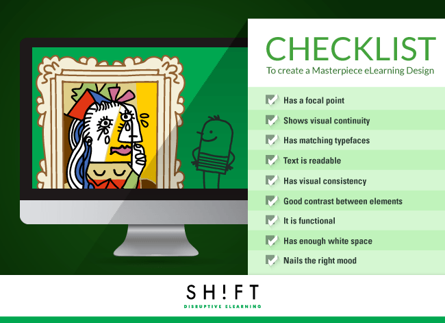
Your visual designing checklist
1. Has a focal point.
You have to make sure that your course not only grabs eyeballs but also keeps the learners hooked. Create visual focal points that cries out for attention.
2. Shows visual continuity.
- Flow or movement is critical to good eLearning design. It is how you lead the learners through your course without making them stumble or wonder where they are supposed to look next. Here are the pointers:
- Chunk and sequence the content first. This helps you figure out how you will place the various elements on screen, so they follow a natural and logical sequence.
- Arrange graphical elements so that they direct learner attention to the content and through it, not away from the screen.
- Build gaps into your design or space out the elements, so the learner can pause and let the content cement in his mind.
3. Has matching typerfaces.
Mixing typefaces is an effective way to create points of visual interest. But beware of ending up with a mess where too many typefaces create clutter.
4. Text is readable.
Readability issues mar the appeal of your course and destroy its instructional soundness. Besides, you risk losing your learners mid-way. Choose the right size for the text. Choose readable fonts.
5. Has visual consistency.
- Create a unifying theme that runs throughout the course.
- Choose a scheme for fonts, colors, and templates so that every page looks like it is a part of the same course.
- Do not overlook seemingly inconsequential elements like buttons, heading sizes, and spacing. Every element on the screen should adhere to the theme.
- Create a standards document for every project. This ensures team members working on a project are on the same page and know how creative they can be so that they do not end up creating wildly different designs.
6. Has good contrast between visual elements.
Use contrasting shapes and colors and contrast between text (size and color) and background (color).
7. It is functional.
- Ensure you arrange the various on-screen elements so that learners don’t have to hunt around for information.
- Ensure that the most critical pieces of information on the screen stand out.
- Create a consistent layout.
- Make navigation intuitive.
8. Has enough white space on the screen.
White spaces provide breathers to learners and create opportunities for them to pause and reflect on previous learning before moving on to the next nugget of information. These negative spaces eliminate clutter and distractions and help learners focus on the most important pieces of content.
9. Nails the right mood.
- Use illustrations and customized photographs that match the mood of the content.
- Use graphics that appeal to the learners’ emotions.
- Use visuals that convey a clear meaning even without the support of the text.
- Use colors to set the mood.
Not all great designers are born. You can learn design skills by following the works of the masters, from experience, and by getting into the shoes of the learners to gauge what motivates them to keep going through a course.


You can adjust your cookie preferences here.