6 eLearning Start-ups Mistakes That Make You Look Unprofessional
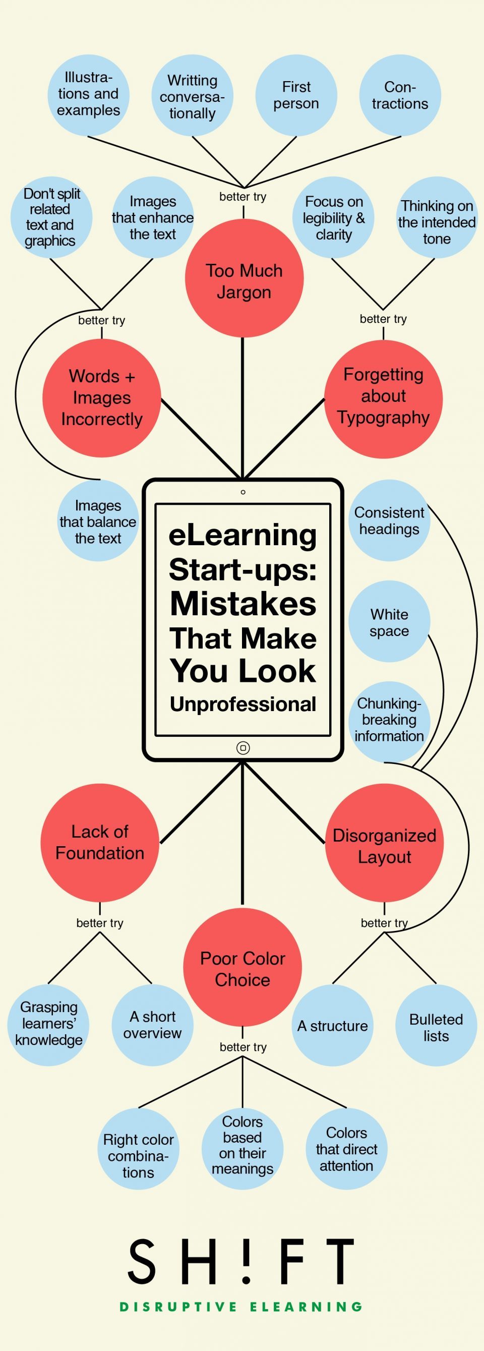
- Disorganized Layout
- Poor Color Choice
- Not Integrating Words and Images Correctly
- Forgetting About the Basics: Typography
- Lack of Foundation
- Too Much Jargon
Information Design refers to the “the arrangement of organization models to provide context and meaning for the information.” It comprises of several disciplines: typography, illustration design, page design, graphics design, communications theory, cultural studies, psychology, and other technical and non-technical practices. The goal is always clarity of communication.
The problem is, a number of common information design mistakes hurt that goal.


You can adjust your cookie preferences here.