

6 Mistakes to Avoid When Writing an eLearning Storyboard Infographic
A movie producer doesn’t show up on the first day of shooting without having completed several planning activities. A script is written, casting is completed, and a storyboard is written and approved. Similarly, when you set out to create an online course, the more planning ahead you can do, the better. Figuring out exactly what you want learners to learn and what each screen will look like saves development time and money. However, writing an effective eLearning storyboard isn’t an easy task.
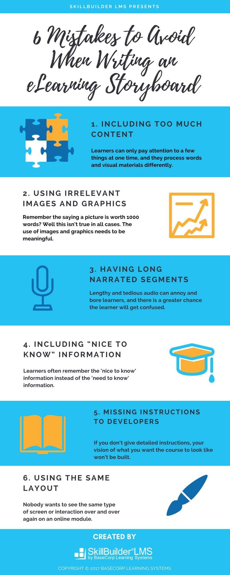
This infographic identifies the six most common storyboarding mistakes.
- Mistake #1: Including too much content on each screen
- Mistake #2: Using irrelevant images and graphics
- Mistake #3: Having long narrated segments
- Mistake #4: Including “nice to know” information
- Mistake #5: Missing (or including vague) instructions to developers
- Mistake #6: Using the same page layout over and over
See also: How to Design Outstanding eLearning Storyboards Infographic


You can adjust your cookie preferences here.