


Top 7 Instructional Design Mistakes and How to Avoid Them
It is important to keep the factors that make an LMS user friendly when designing an LMS's user Interface. The Top 7 Instructional Design Mistakes and How to Avoid Them Infographic mentions in detail the mistakes for a UI designer to avoid at all costs:
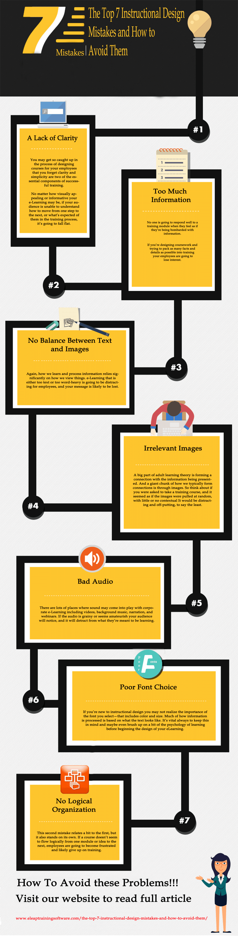
1. A Lack of Clarity.
You may get so caught up in the process of designing courses for your employees that you forget clarity and simplicity are two of the essential components of successful training. No matter how visually appealing or informative your eLearning may be, if your audience is unable to understand how to move from one step to the next, or what’s expected of them in the training process, it’s going to fall flat.
To Avoid This: After you design coursework have several other professionals go through and give feedback as to how well they understand what’s happening on the screen in front of them. You want to be realistic with course design. Gaining feedback before introducing it to employees is a necessary part of this.
2. No Logical Organization.
This second mistake relates a bit to the first, but it also stands on its own. If a course doesn’t seem to flow logically from one module or idea to the next, employees are going to become frustrated and likely give up on training.
To Avoid This: Plan, plan and plan some more before you actually begin the process of designing online training. An excellent tool to help in the instructional design process is a storyboard. With a storyboard, you can lay out each area of the course, ask for feedback and change things around to ensure the best possible flow and logical design. Storyboards can cover everything from how information is presented to the type of navigation that will be used. It’s much easier to correct your model when it’s in storyboard form, as opposed to once it’s been delivered to employees.
3. Too Much Information.
No one is going to respond well to a training module when they feel as if they’re being bombarded with information. If you’re designing coursework and trying to pack as many facts and details as possible into training your employees are going to lose interest.
To Avoid This: Cut your content down to the bare bones, must-know information. If you have even the slightest question as to whether you should include certain information in your eLearning, it’s best to leave it out.
4. Irrelevant Images.
A big part of adult learning theory is forming a connection with the information being presented. And a giant chunk of how we typically form connections is through images. So think about if you were asked to take a training course, and it seemed as if the images were pulled at random, with little or no contextual It would be distracting and off-putting, to say the least. Unfortunately, this is something a lot of new instructional designers do: they add irrelevant images that aren’t a good fit with the content just for the sake of having images. Yes, images are important, but only when they add to what’s being taught to employees.
To Avoid This: Be careful when sourcing images, and if it doesn’t make sense to have one just leave it out. Yes, images can enhance the learning experience, but they should be used wisely. Otherwise, you’re going to have employees scratching their heads and wondering what you were thinking, rather than focusing on the training module. Also, focus on the quality of the images. Poor quality images will drag down the overall perception of the entire course.
5. Bad Audio.
There are lots of places where sound may come into play with corporate eLearning including videos, background music, narration, and webinars. If the audio is grainy or seems amateurish your audience will notice, and it will detract from what they’re meant to be learning.
To Avoid This: When it comes to audio, this can be a great place to invest in some outside help. You may want to consider working with a freelance professional who can help you ensure narration and other audio elements are just right.
6. Poor Font Choice.
If you’re new to instructional design you may not realize the importance of the font you select—that includes color and size. Much of how information is processed is based on what the text looks like. It’s vital always to keep this in mind and maybe even brush up on a bit of the psychology of learning before beginning the design of your eLearning.
How To Avoid This: One thing to remember, even if you’re not an expert on learning theories, is that consistency is key. Don’t overwhelm learners with widely varied fonts throughout a training module. Use font as a method to emphasize important areas, but only when it’s necessary. Consider having a few other people look at your font choice before you launch a new eLearning course to trainees and have them give you their perception of the fonts.
7. No Balance Between Text and Images.
Again, how we learn and process information relies significantly on how we view things. eLearning that is either too text or too word-heavy is going to be distracting for employees, and your message is likely to be lost.
How To Avoid This: Try to strike a careful balance between images and words. Keep your text short, sweet and to the point, and don’t worry about filling up every square inch of the screen. In fact, having some white spaces can help learners process information better. Using either too many words or too many images are not going to help employees learn the concept and it is likely to do quite the opposite.
Besides these there are other mistakes as well such as complicating the user interface by incorporating too many features, bad color choice, etc. An LMS must be as user-friendly as possible and this is the recipe to success of any software application including training management systems.


You can adjust your cookie preferences here.