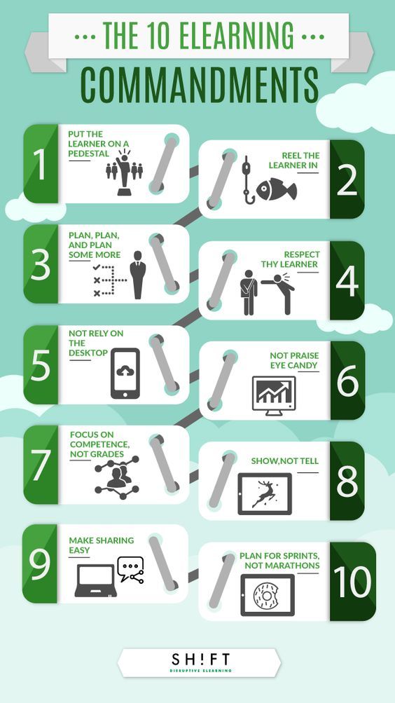
...The 10 eLearning Commandments...— Infographic
Malcolm Gladwell, author of ‘Outliers’ says that to truly master something takes 10,000 hours of practice. That’s a long time.
But while Gladwell is probably not too far off the mark, we’d add one small caveat: 10,000 hours of practicing the right way, with the right foundations.
So we’ve put together the 10 commandments eLearning professionals must follow to see their courses be a success. Take these rules, incorporate them into your eLearning, and get busy mastering your craft.
#1) Thou Shalt Put the Learner On a Pedestal
Now, that doesn’t just mean fancy graphics and cool technology; it’s about making the eLearning experience bespoke, unique, and focused on the learner.
Ensure that your learner feels in control and well-oriented. The learner has to know what, why, and where learning is taking place.
While UX has been around for a while now, the advent of responsive eLearning has brought it back into the public eye. It’s now more important than ever. So this is commandment #1. Make sure the learner experience is put first and foremost.
This means communicability, aesthetics, and navigability are the primary concern (after of course, the learning material).
Learn more: Four Key Elements of Learning Experience Design
#2) Thou Shalt Reel the Learner In
Sorry to use a weird analogy, but think of your learner as a fish. You’ve got to provide some juicy bait for them to bite onto. You’ve got to sell it to them. Like the Wolf of Wall Street, but with more education.
Opening lines are the key to grabbing a learner’s attention. Cliché it might be, but even beginning with a joke is better than a long, convoluted sentence a la “In this learning program you will undertake a multifaceted and various…” Or simply an honest introduction, like you’re meeting someone for the first time, could work better than the standard introductory sentence.
So that leads us onto commandment number two. You have to come up with a way to hook the learner in and get them engaged early on. How you do this, well that’s up to you.
Also read: Create Your eLearning Course to Grab Your Learner's Attention Faster
#3) Thou Shalt Plan, Plan, and Plan Some More
Behind every successful man, there is a woman, or so the saying goes. And behind every successful eLearning project, is a well-devised and detailed plan.
While storyboards come in all shapes and sizes, and they depend on the medium you’re using, the budget, the software, and all of these other exciting details, you should never treat it as an afterthought. It has to be more than a sketch on the back of a cigarette packet.
It’s rumored that Nikola Tesla designed mechanical objects in his head, and identified problems before even putting them together. The same principle (kinda) is why we storyboard: we see the problems early on before we’ve committed time, and expense, to bring the project to life.
When you storyboard effectively, you reduce the chances of your client being unhappy, increase the efficiency of the project, and give yourself a better blueprint for the building process. It’s absolutely vital and often overlooked by many eLearning developers who are concerned with ‘getting it done as fast as possible. Don’t be one of them.
Recommended read: A Simple Guide to Creating An eLearning Storyboard
#4) Thou Shalt Respect Thy Learner
“R-E-S-P-E-C-T. Don’t know what it means to me” – Aretha Franklin
Ms. Franklin was right. Relationships require respect.
You’ve got to respect your learner’s intelligence and respond to their needs. Make sure you understand their background, how they like to learn, and what style of learning appeals to them. If you hit the wrong tone, your learners may feel demeaned and even insulted.
One more point – remember to have the training delivered when appropriate. For an auditor in the busy season, training is likely to take a backseat. In the quiet season, they’ll likely have more time to focus and have greater uptake of knowledge. That’s something to take into account.
#5) Thou Shalt Not Rely On Desktop-Only Courses
Where’s your smartphone right now? In your pocket? On your desk? I’ll bet it’s not too far. Mine’s not either, it’s sitting right next to me on the desk. More than 66% of people use their smartphones at home, at work, and in between. It doesn’t take a genius to work out that eLearning has to evolve.
In today’s multi-screen world, it’s easy to think of learning on different platforms, with desktops, tablets, and smartphones each with different compatibilities and operating systems. Elearning has to change. It has to be responsive, multi-format, and look good on whatever device it’s used on.
This’ll raise engagement, increase productivity, and means that your learners can access training from wherever they are. The result is better, more effective, and more natural learning. So that’s number five.
Also read: Thriving as an Instructional Designer in a Multi-Device World
#6) Thou Shalt Not Praise Eye Candy
Yes, visuals are important, and yes, sleek graphics can really make an impact and grab learners’ attention.
But you’ve got to keep in mind that graphics are a lot like salt and pepper. A little can make your course more delicious, but overdo it and well…it’s inedible.
eLearning is a practice of restraint and balance. Remember to use useful design, not decoration, and give breathing room. Just like in photography, negative space can sometimes make all the difference; there’s no need to fill every little space.
#7) Thou Shalt Focus On Competence, Not Grades
Competency-based learning lets learners move through a course at their own pace. This is a more valuable approach; the focus isn’t on completing a training program within a specific time, it’s about doing it slowly, and doing it right. Competency-based training doesn’t randomly “dump” tons of knowledge on the learner, it lets the learner choose. They know when to move on, and when they’ve absorbed the material. This makes learning more effective than the “dump and run” model and the learner feels more satisfied and leaves no gaps in their skill set.
#8) Thou Shalt Show, Not Tell
We’ve all been there. Bored in a presentation or taking an eLearning course. Checking the time every few seconds, wondering when it’s going to end.
Why do we feel this way? Usually, because eLearning is designed as just conveying information, just telling. Just being spoken at.
This is one of the least effective ways to share information. If you want your audience to remember your content, you need to show, not tell. This means you should tell more stories in your course, give examples, create scenarios, you have to give the audience something they can relate to, and help them find connections between the learning content and their roles.
In a nutshell, this is how to do it: less exposition, more action. You'll see how your learners react in a completely different way.
Also read: 6 Ways to Incorporate Examples into Your eLearning Courses
#9) Thou Shalt Make Sharing Easy
Industry expert, Alisson Rosset states that learning is now less often in the classroom, and more often where the work gets done, through networks, communities, and online conversations.
I can’t argue this.
eLearning has to be more sociable, not just formal. Develop your trainer’s toolbox and add in some collaboration features, even a billboard, an online message board, or a wiki. Try new things to get your learners not only to engage and retain information but to share it with one another and fill in each other’s gaps.
The bottom line is sharing gets results. So this commandment is to increase sharing. My pro tip is to think about social settings the next time you’re developing your courses; so learners get the chance to connect as humans.
#10) Thou Shalt Plan for Sprints, Not Marathons
I know, this sounds counter-intuitive. But hear us out. Nowadays, learners struggle with information overload. We have stuff coming at us from mobile phones, email, the web, and good ol’ fashioned verbal communication.
Learners have too much going on already – if you bombard them with the information they’re going to tune out quickly. They might retain scraps, a keyword here and there, or they might retain nothing. Don’t risk it. Organize your content into small, bite-sized ‘sprints’.


You can adjust your cookie preferences here.