How to Design an Awesome School Website Infographic
Creating an outstanding school website design is a great way to attract parents, teachers and pupils. Many school websites look too simplistic and colourful, making the content too hard to read and confusing for users looking for information.
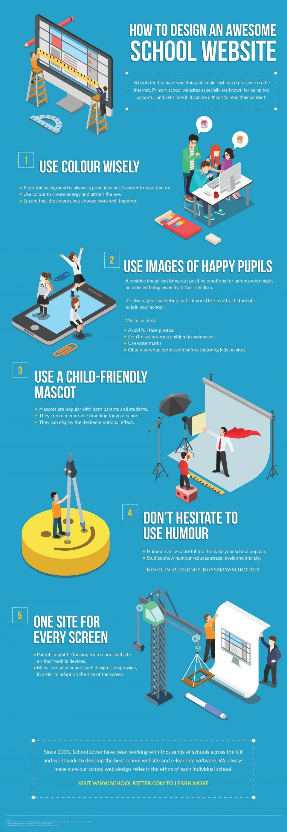
You need to make sure your school’s ethos is reflected on your school web design, so it’s important to choose a website builder that is both easy-to-use and attractive. The How to Design an Awesome School Website Infographic aims to help schools create a much nicer presence on the internet. Enjoy!
5 Tips for Designing an Awesome School Online Presence
- Use colour wisely.
- Use images of happy pupils.
- Use a child-friendly mascot.
- Don't hesitate to use humour.
- One site for every screen.


You can adjust your cookie preferences here.