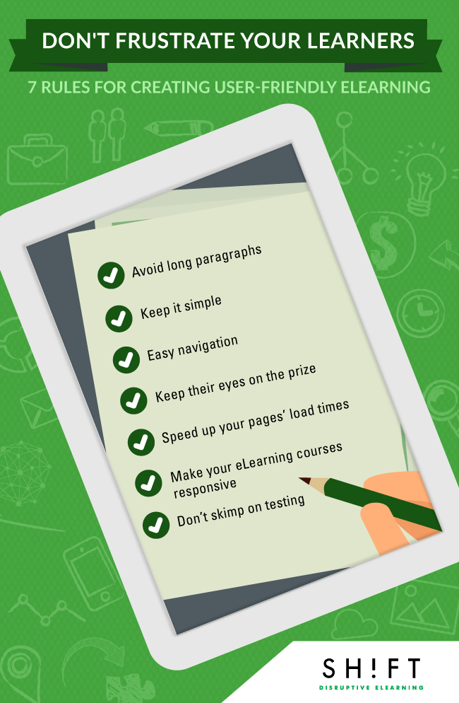
How to Create User-friendly eLearning Courses Infographic
Taking the time to go through and check for user-friendliness will help ensure that your students don’t lose out just because the course is difficult to navigate. Here are seven rules you should follow for creating user-friendly eLearning courses:
- This isn’t a novel, don’t write it like one. Avoid long paragraphs.
- Don’t let design interfere with function. Keep it simple.
- Figure out your navigation, so your users don’t have to.
- Keep their eyes on the prize.
- Speed up your pages’ load times.
- Consider all your users. Make your eLearning courses responsive.
- Don't skimp on testing.


You can adjust your cookie preferences here.