Choosing Templates for eLearning Courses Infographic
When it comes to an eLearning course, the optimization of the template will make it more professional and visually appealing. Using templates for eLearning courses is, definitely, a perfect jumpstart for those who want to set up a course with an accelerated outcome and reduced time spent. So, what are the characteristics that make templates so desirable?
- Templates improve productivity: Forget starting everything from the scratch, using a prefigured template saves you a ton of time in deed. A template combines a set of slides with a predesigned theme, structure and color which support content including definitions, procedures, and specific presentation patterns. Thanks to that, you can stay focus on what you are going to present rather than how to arrange elements.
- Templates make your courses more engaging: As a matter of fact, learners often associate a bad-looking course with non-professionalism and amateurishness. Choosing an appropriate template adds a great deal of visual appeal to your works, supports the content arrangement substantially that raises learner concentration and absorption.
- Templates organize information logically: Without templates, have you ever been frustrated of figuring out how to place different elements of content and pieces of information? Those designing burdens may enervate instructors and cause them to end up with slides with texts and objects all over the place. Ready-to-use templates can help instructors organize course information manifestly and coherently.
What to Bear in Mind When Choosing Templates for eLearning Courses
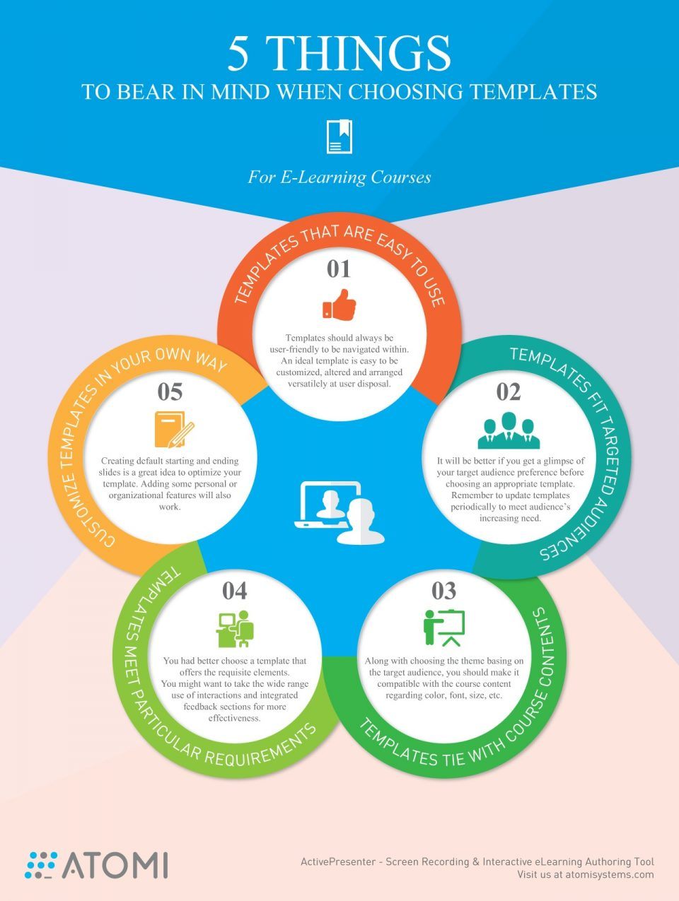
Here are 5 things you should bear in mind when choosing eLearning course templates
1. Templates that are easy to use
First and foremost, no matter how it looks, a template should always be user-friendly to be navigated effortlessly. In addition, an ideal template should be easy to be customized, altered and arranged versatilely at user disposal.
2, Templates fit targeted audiences
It’s crucial to get a course that is audience-focused regarding both content and design. You might want to get a glimpse of your audience preference before choosing an appropriate template. Saying, no postgraduate learner wants a pinky and garish template, for example.
Besides, after choosing a default template, you should keep on updating your templates periodically so as to meet your audience’s changing and increasing need.
3. Templates tie with course contents
The fact is that every template is created around a theme that includes color, font, size, etc. Choosing a content-based theme enhances the consistent delivery of the course content. Text fonts and size also contribute massively to the overall impression. Some fonts seem to be more soft and feminine while others more solid and somber. So, the templates you choose should always be compatible with the course content.
4. Templates meet particular requirements
The ultimate goal of an eLearning course is to convey a training or spread information in the most effective way possible. You had better choose a template that offers the requisite elements, a wide range of interactions or integrated feedback sections for instance.
5. Customize templates in your own way
It’s not to say which template is the best, but creating a default starting and ending slide is a great idea to optimize your template. You can also add some additional features to customize template use.
The next time you develop an eLearning course, try to apply these previous five tips and surprise your learners with your work.


You can adjust your cookie preferences here.