6 Tips To Use Colors When Designing eLearning Courses Infographic
eLearning developers must familiarize with color psychology before start designing. Check the 6 Tips To Use Colors When Designing eLearning Courses Infographic.
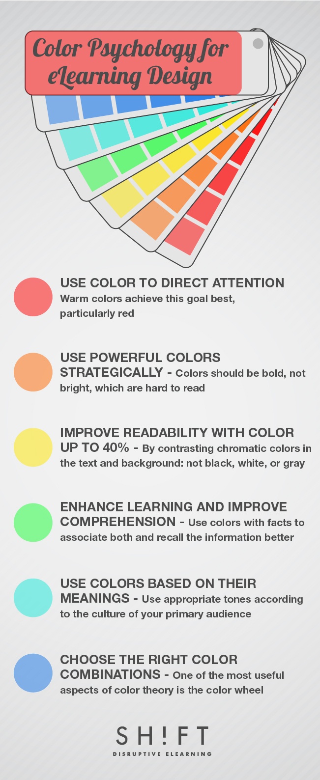
Color Psychology for eLearning Design
- Use Color to Direct Attention
Color can help reduce boredom and passivity, thus improving attention spans. When learners pay more attention while learning, recall rates and reaction times increases. - Use Strong Colors Strategically
Developers should use strong and bright colors sparingly or place them over neutral background tones when designing eLearning materials. - Improve Readability With Color
Color can enhance clarity and readability in the text by as much as 40%. - Enhance Learning and Improve Comprehension
As color connects neuropathways, people remember colors better than verbal or textual cues alone; for instance, The Institute for Color Research – now called Color Matters, confirmed that color can improve learning from 55% to 78% as well as comprehensive by as much as 73%. - Use Colors Based on Their Meanings
Even developers who personally dismiss the idea that every color has a distinct meaning should take color connotations into account when designing eLearning courses. This is because the students may consider the significance of color, whether consciously or unconsciously. - Choose the Right Color Combinations
One of the most useful and simplest aspects of color theory is the color wheel. This shows which colors are harmonious and helps ensure developers create a color combination that avoids straining learners’ eyes.
Research has found that 80% of information processed by the brain of an Internet user comes from sight and yet other studies have discovered that people are exceptionally sensitive to visual cues when learning. These two pieces of information suggest that visual content is a key factor in eLearning and applying graphic techniques appropriately could enhance knowledge acquisition.
One way to utilize the power of visual tools is through the use of color. Colors are powerful psychological triggers that help users learn better by changing their perception and evoking emotions. However, it is also important to remember that excessive use of color leads to cognitive overload and becomes counter-productive. Therefore, it is necessary to find the right balance.
eLearning developers must familiarize with color psychology before start designing. That's why this post will look at some ways in which they can use color when creating eLearning courses by taking physiological and psychological effects into consideration.


You can adjust your cookie preferences here.