5 Reasons to Start Using Infographics in Your Online Courses Infographic
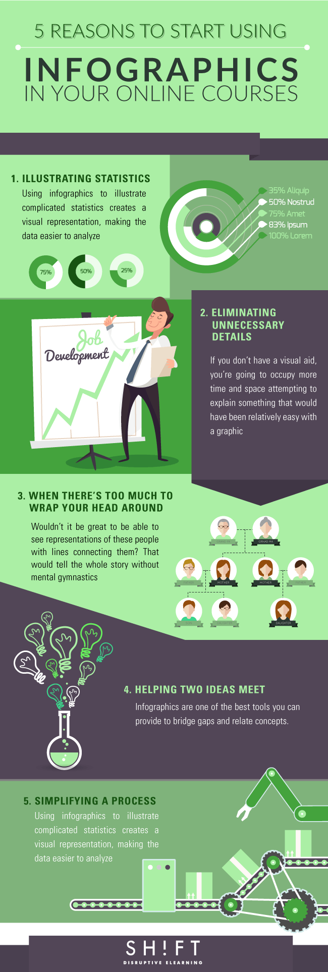
When given the opportunity, people would much rather look at an image or watch a video than read, and taking advantage of that for your online course design can help improve learner engagement by appealing to the common preference of visual learning. Here are 5 Reasons to Start Using Infographics in Your Online Courses Infographic.
1. Illustrating statistics
Using infographics to illustrate complicated statistics creates a visual representation, making the data easier to analyze. If learners know what they’re reading, they’ll be more inclined to retain the key points of your statistics.
2. Eliminating unnecessary details
If you don’t have a visual aid, you’re going to occupy more time and space attempting to explain something that would have been relatively easy with a graphic. An infographic will allow you to present direct comparisons and representations of the concepts you’re attempting to convey without convoluting your information. You won’t run the risk of learners becoming confused or bored.
3. When there's too much to wrap your head around
Wouldn’t it be great to be able to see representations of these people with lines connecting them? That would tell the whole story without mental gymnastics.
4. Helping two ideas meet
If you’ve taught two separate concepts that are intended to come together at some point, it won’t always be apparent how they work synergistically. Infographics are one of the best tools you can provide to bridge gaps and relate concepts in your eLearning courses.
5. Simplifying a process
An infographic can help relate the information to a visual of what occurs at a specific point during that process. Following the infographic to the end, your learners will understand the concept from start to completion while being able to see with their own eyes how a transformation is transpiring.
Though infographics are excellent tools, they won’t be as effective if they aren’t designed correctly. Stick with appealing color schemes, simple graphics, and valuable information. Never use an infographic just for the sake of having one, and don’t create a graphic that’s too complicated to serve its need. The purpose is to simplify, not to decorate.
Read also:


You can adjust your cookie preferences here.