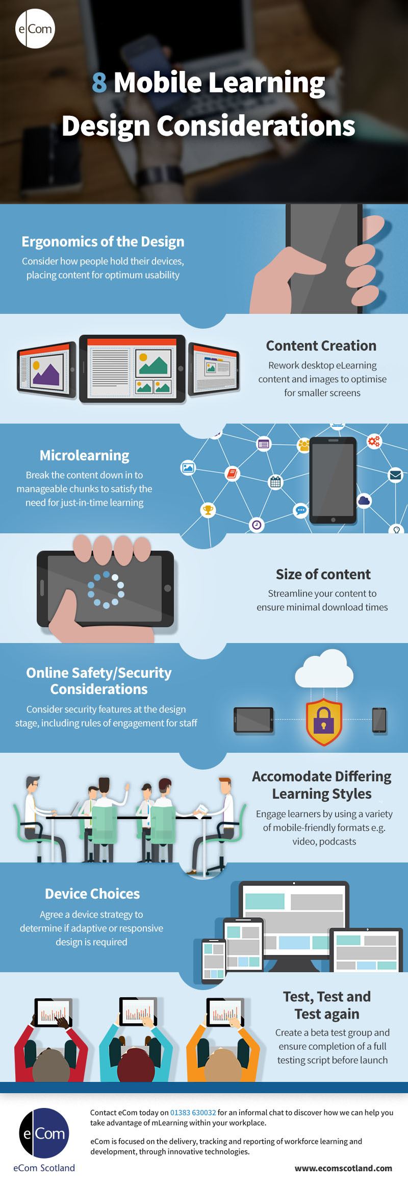
8 Mobile Learning Design Considerations Infographic
According to Statista, the number of mobile phone users in 2017 is forecast at a staggering 4.77 billion. It is a trend that is not going away. Organisations now need to consider mobile delivery when developing learning for their workforce. As you start scoping your mLearning, there are a number of important design decisions to be made.
1. Ergonomics of the Design
When designing for mobile devices, you need to consider how people hold their devices and the impact on content placement. For example a “next” button which would normally live in the bottom right hand corner on a desktop designed eLearning course should be repositioned to be optimised for mobile device usage.
2. Content Creation
It is wrong to assume that content can simply be lifted from an existing eLearning course and fitted into a mobile design. With mLearning there is often a need to restructure information, change the choice of media, and rework images and graphics to make the content work on smaller screens or suit users learning on the move.
3. MicroLearning
Mobile learning lends itself to just-in-time learning. Users are accessing content on the go and at a fast pace. With growing demands on our time, ensuring that the content is broken down into manageable bite sized chunks of learning encourages better engagement.
4. Size of content
There is a general expectation from desktop users that content be available within 2 seconds. Mobile users are for the moment slightly more patient however you are competing with other barriers to learning. With mobile learning, distraction from external stimulations and the lure of social media can hinder progress so it is important that content is available at an acceptable speed.
5. Online Safety/Security Considerations
Online security issues deters some organisations from introducing mobile learning. Employers want to track learning and engagement. However, with the creation of user accounts comes the threat of hackers gaining access to sensitive information. It is important to incorporate security requirements at the design stage, including authentication, sign-in procedures and rules of engagement for employees.
6. Accommodate Differing Learning Styles
To compensate for distractions and encourage engagement and retention of knowledge, consideration should be given to tailoring learning to accommodate different learning styles. A mobile learning platform lends itself to incorporating podcasts, videos, interactive quizzes and ebooks.
7. Device Choices
Users may be accessing the same learning content from different devices, on desktop in the workplace and mobile device when out of the office. In mLearning which uses responsive design, content is automatically repositioned dependant on the device so it is important to consider positioning of content in the original design. With adaptive design you can create different templates to suit each device, giving more freedom to customise how content is being viewed.
8. Test, Test and Test again
As with the design of any new content or medium, you must test and retest. Establishing a beta test group gives you true testing data as well as the potential to create a super user group which can support the company wide implementation of the learning.



You can adjust your cookie preferences here.