What to Avoid When Selecting an LMS Infographic
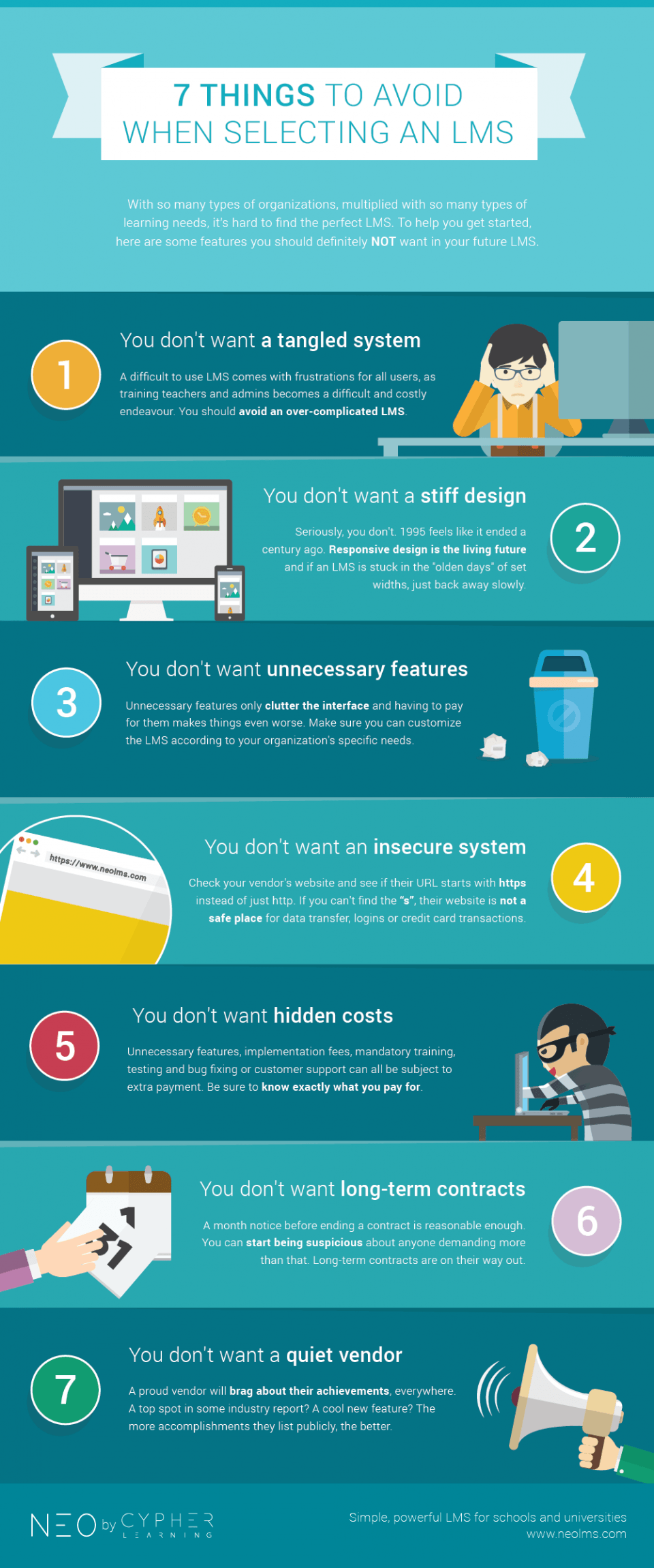
With so many types of organizations, multiplied with so many types of learning needs, it's hard to find the perfect LMS. To help you get started, the What to Avoid When Selecting an LMS Infographic presents some features you should definitely NOT want in your future LMS:
1. You don't want a tangled system
A difficult to use LMS comes with frustrations for all users, as training teachers and admins becomes a difficult and costly endeavour. You should avoid an over-complicated LMS.
2. You don't want a stiff design
Seriously, you don't. 1995 feels like it ended a century ago. Responsive design is the living future and if an LMS is stuck in the "olden days" of set widths, just back away slowly.
3. You don't want unnecessary features
Unnecessary features only clutter the interface and having to pay for them makes things even worse. Make sure you can customize the LMS according to your organization's specific needs.
4. You don't want an insecure system
Check your vendor's website and see if their URL starts with https instead of just http. If you can't find the "s", their website is not a safe place for data transfer, logins or credit card transactions.
5. You don't want hidden costs
Unnecessary features, implementation fees, mandatory training, testing and bug fixing or customer support can all be subject to extra payment. Be sure to know exactly what you pay for.
6. You don't want long-term contracts
A month notice before ending a contract is reasonable enough. You can start being suspicious about anyone demanding more than that. Long-term contracts are on their way out.
7. You don't want a quiet vendor
A proud vendor will brag about their achievements, everywhere. A top spot in some industry report? A cool new feature? The more accomplishments they list publicly, the better.


You can adjust your cookie preferences here.