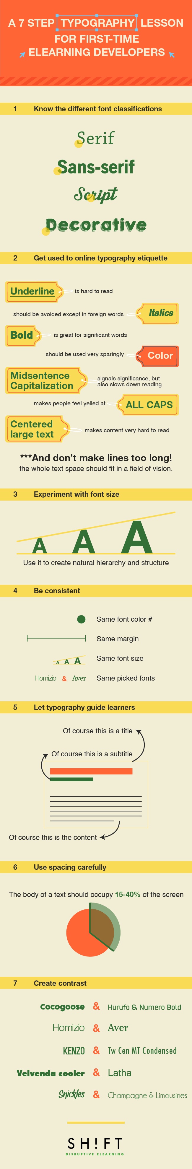
Typography Lesson for eLearning Developers Infographic
A basic knowledge of typography is a must for any eLearning designer. Good typography enhances readability, encourages information processing, creates a visual hierarchy, and even engages readers' emotions.
- Know the different font classifications.
Fonts come in four main categories: serif, sans-serif, script, decorative. For eLearning screens, sans-serif fonts are almost always the best bet, as they are the most easily legible. - Get used to online typography etiquette.
Underlining is hard to read. Italics should be avoided except in foreign words. Bold increases text visibility; use it for headings and words of significance. Midsentence capitalization signals significance, but also slows down reading. ALL CAPS makes people feel yelled at. Centered text makes content very hard to read. Don't make lines too long: the whole text space should fit in a field of vision. - Experiment with font size.
Whichever base size you choose, relative font size can be used to create natural hierarchy and structure. Larger words are often used for headings, titles, or terms of importance, as they draw the eye. - Be consistent.
Keep text location consistent from screen to screen, above all, and use similar formatting. If you use bullets, use them the same every time. Always place headings and subheadings in the same place. The number of fonts you use is an important consideration too. Use no more than one or two fonts, three at most. They create hierarchy and interest but can easily be overdone. - Let typography guide learners.
To help readers focus, keep your information sorted according to natural reading patterns. Learners usually enter through a visual element, such as a heading or use of color. With the right font, font size, spacing and color, you create a visual hierarchy that assists the visual walk-through. - Use spacing carefully.
The body of a text should occupy 25-40% of the screen, with line spacing in proportion to the text size. The key thing to avoid is a dense "brick" of text, which loses the eye quickly. - Create contrast.
Learners naturally scan from point to point rather than reading line by line. In order to make this work for you, use typographic contrast to create emphasis on certain text. Not only does this enhance the visual appearance, but it also directs the learner's attention to the important content.


You can adjust your cookie preferences here.